It is time for round three of the UK vs US book covers! To recap, after round two the US are leading with 13 points and the UK are slightly behind with 11 points. If you missed the other rounds, I will link them at the end of the post. Just like before, the UK covers will be on the LEFT and the US covers will be on the RIGHT. (Please note: this post is purely for the covers–I probably haven’t read the majority of these but I have heard of them.)
Hamnet by Maggie O’Farrell


*I haven’t read this* This was an easy decision to make because I am not a big fan of people’s faces on the cover. However, I will say that I like the use of the scrolls on the US cover as it makes the title and author’s name stand out. It also gives a nice historical vibe to the cover. On the UK cover, I really like the blue against the gold and again it feels very historical.
MY WINNER: UK cover
Weather by Jenny Offill


*I haven’t read this* This was a tough decision to make because I actually really like both covers. I do feel that the UK cover is very striking and gives me ‘weather channel’ vibes but I like the different types of weather being shown on the US cover. I think the title of the US cover stands out more in comparison to the UK cover but I don’t like that we get a glimpse of a person’s face on the US cover. I’ve decided that this one is a tie.
MY WINNER: Both covers
Remarkably Bright Creatures by Shelby Van Pelt


*I haven’t read this* I know there are some different colour backgrounds for the UK cover but I picked the one that I liked the most out of them. This is another tough decision to make but I think I’m swayed more to the UK cover. I love how they both have octopuses on the covers but I think the UK one stands out more. I also really like the bright pink font used. That being said, I do like that we get more of an ocean vibe on the US cover but I would’ve preferred it without the person being on there.
MY WINNER: UK cover
Howl’s Moving Castle by Diana Wynne Jones


*I haven’t read this* Another difficult one to choose from but again I’m swayed more towards the UK cover. I will say that I love the fact we have a castle with legs on the US cover as it seems to fit well with the title but the cover feels very old in art style. The font used on the US cover is very cool though I will admit! However, I’m loving the pastel vibes on the UK cover and the big white font helps the title really stand out.
MY WINNER: UK cover
Where the Dark Stands Still by A.B. Poranek


*I haven’t read this* This was such an easy decision to make! I absolutely LOVE the US cover and the vibes it is giving me. Don’t get me wrong, the UK cover is still pretty but the US cover catches my eye more. The title on the US cover stands out a lot more than the one on the UK cover and I like how it isn’t taking up the whole space on the cover. I do like the colours used on the UK cover but the aesthetics on the US cover is drawing me in.
MY WINNER: US cover
Funny Story by Emily Henry


*I haven’t read this* Oooooh this was a tough decision to make because I really like both of these covers. I do like the colours used on the UK cover but the blue on the US covers looks very clean and pleasing to the eye. The person laughing on the cover of the UK one feels very fitting to the title of the story in comparison to the person on the US cover. I much prefer the font used on the US cover compared to the US because the UK cover looks like a font used in Microsoft Word… I can’t decide between them so I’m going to say it’s a tie.
MY WINNER: Both covers
The Naturals by Jennifer Lynn Barnes


*I have read this* This one was such a quick decision to make. I do like the police tape on the present for the US cover and how the title has been done but honestly, the UK cover is much more striking to me because of the blue that is used against the black. I will say that I don’t like the font used on the UK cover but I think the white is a great colour to use to make it pop against the other colours.
MY WINNER: UK cover
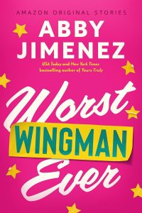
Yours Truly by Abby Jimenez


*I haven’t read this* This was really tough to decide between because I do like both covers. However, I much prefer the reddy pink colour used on the US cover with the yellow title. I do still like the yellowy green used on the UK cover but it’s not a colour I really gravitate towards. The font choice on the US cover looks a lot cleaner in comparison to the UK cover which seems too thick… if that’s the right word… The people on both covers are almost identical but I do like the addition of the dog on the US cover.
MY WINNER: US cover
Swept Away by Beth O’Leary


*I haven’t read this* Ahhhhh I cannot decide, they are both so pretty!!!!!! I love the colours used in the background on both of them as well as the fonts. I cannot say much else because they are both great!
MY WINNER: Both covers
The Song of Achilles by Madeline Miller


*I haven’t read this* There are two very different covers… I do like the colours used on the US cover but I’m not a fan of having a massive helmet on the front. The blue on the UK cover is pretty and I like the darkening on the corners but the thing that stole my vote was the fact we have a bow and arrow shaped into a heart! I also prefer the white font on the UK one in comparison to the black font used on the US cover.
MY WINNER: UK cover
And that leads us to the end of round 3! Time to see the updated scores…
UK COVERS: 19 Points
US COVERS: 18 Points
Ooh we have a very close score after that round with the UK leading by 1 point!


Leave a Reply